From Photo to Map: A Coastal Monitoring Survey at Flying Point Beach
Many people know Gaia Aerial Imagery for the photography — the wide, clean aerial shots of Long Island's coastline. But photography is only half of what we do. The other half is mapping: turning a drone flight into precise, high-resolution data that can be measured, compared, and tracked over time.
This post walks through what that actually looks like, using a recent flight over Flying Point Beach as the example.
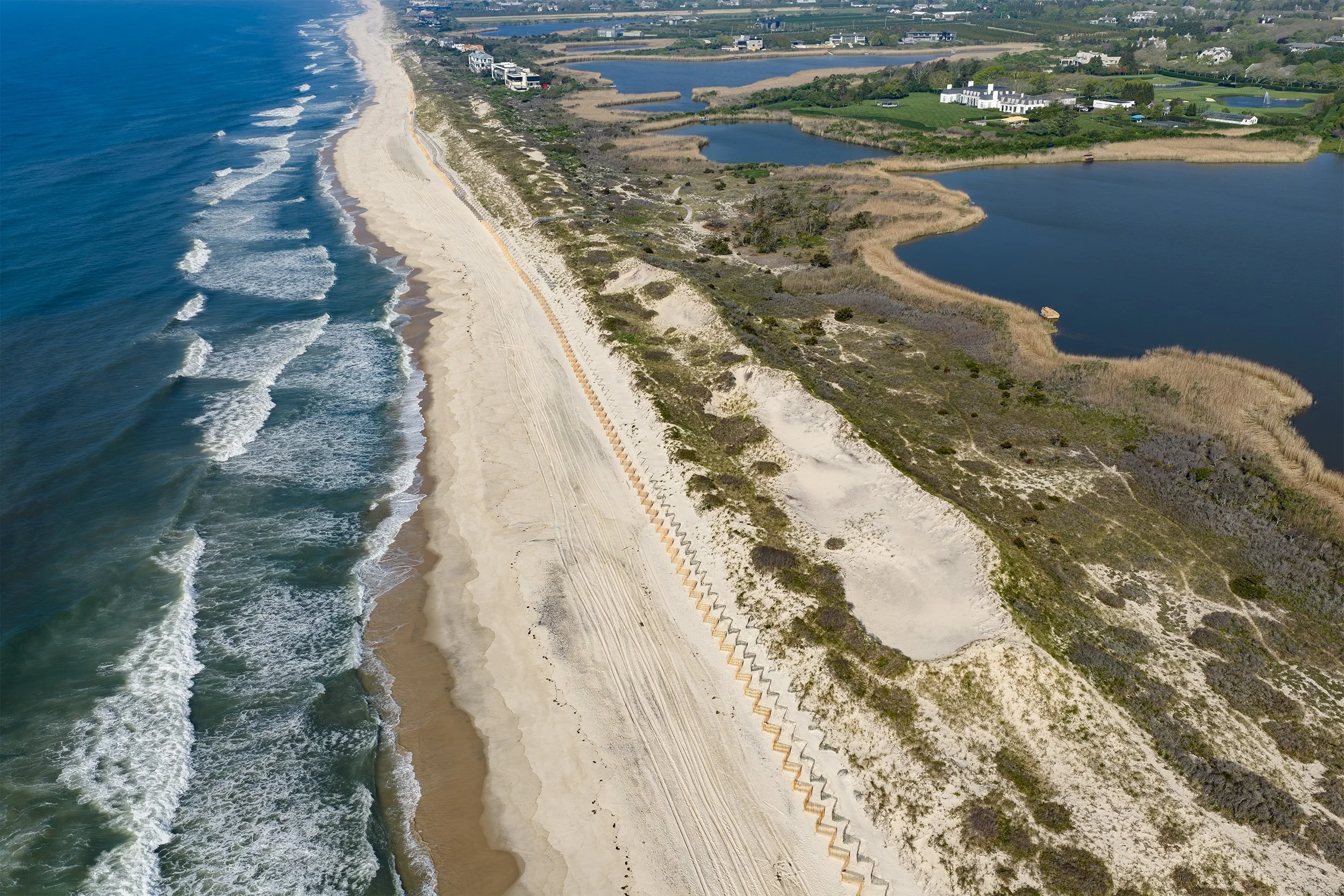
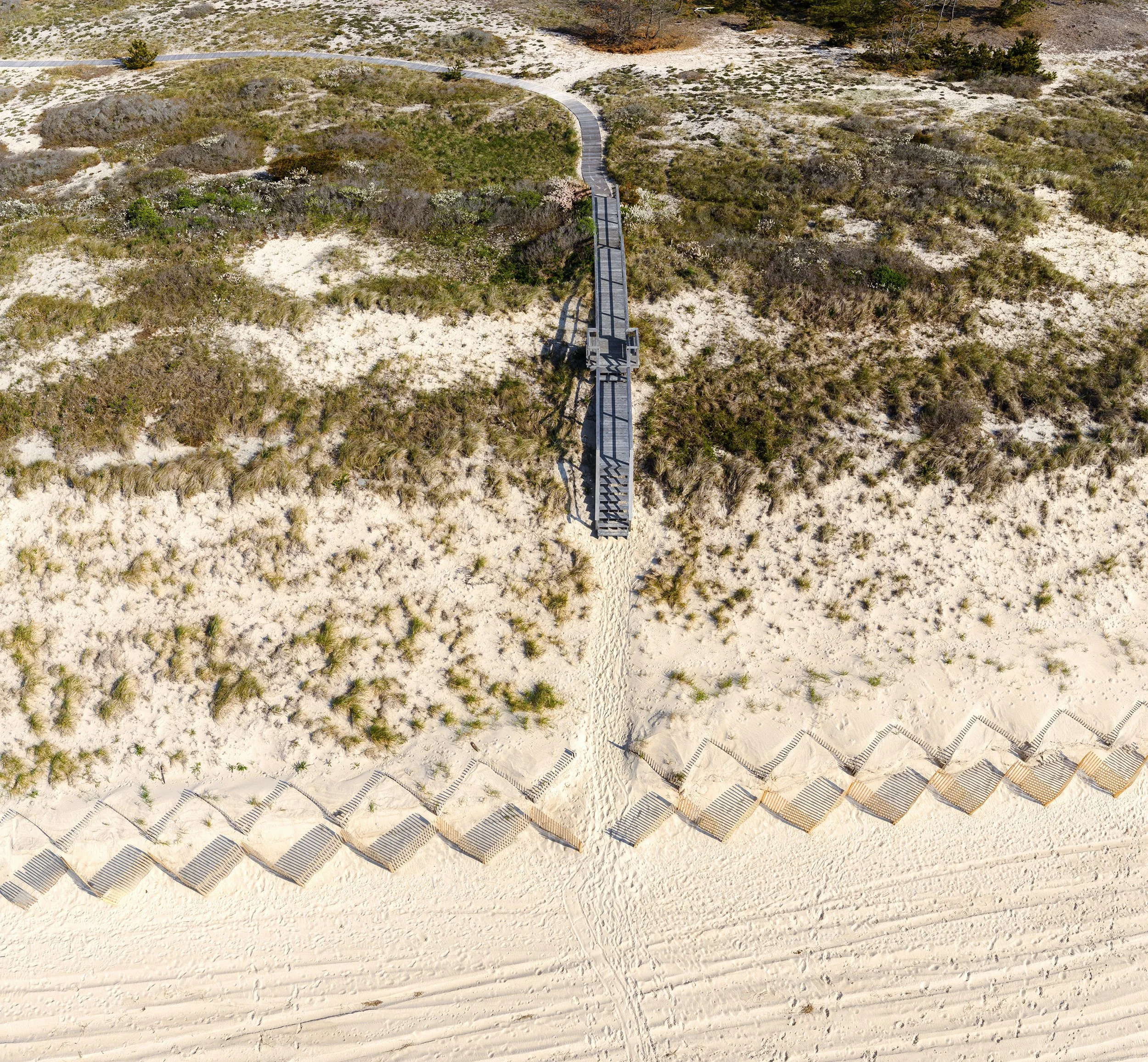
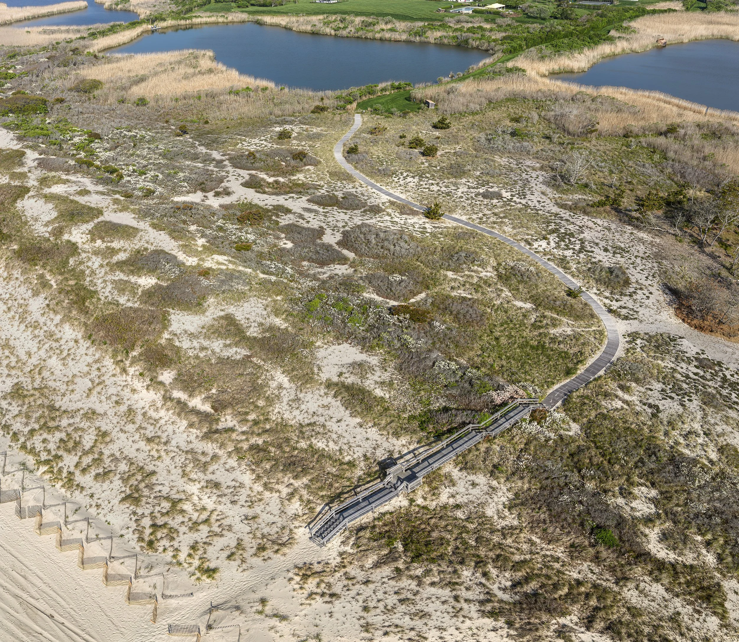
It starts the same way every flight does
Every project starts with photos like these — a single, striking frame of the coastline and its unique features. These are the kinds of images that work on their own. But it's also just the first output of a much larger dataset.
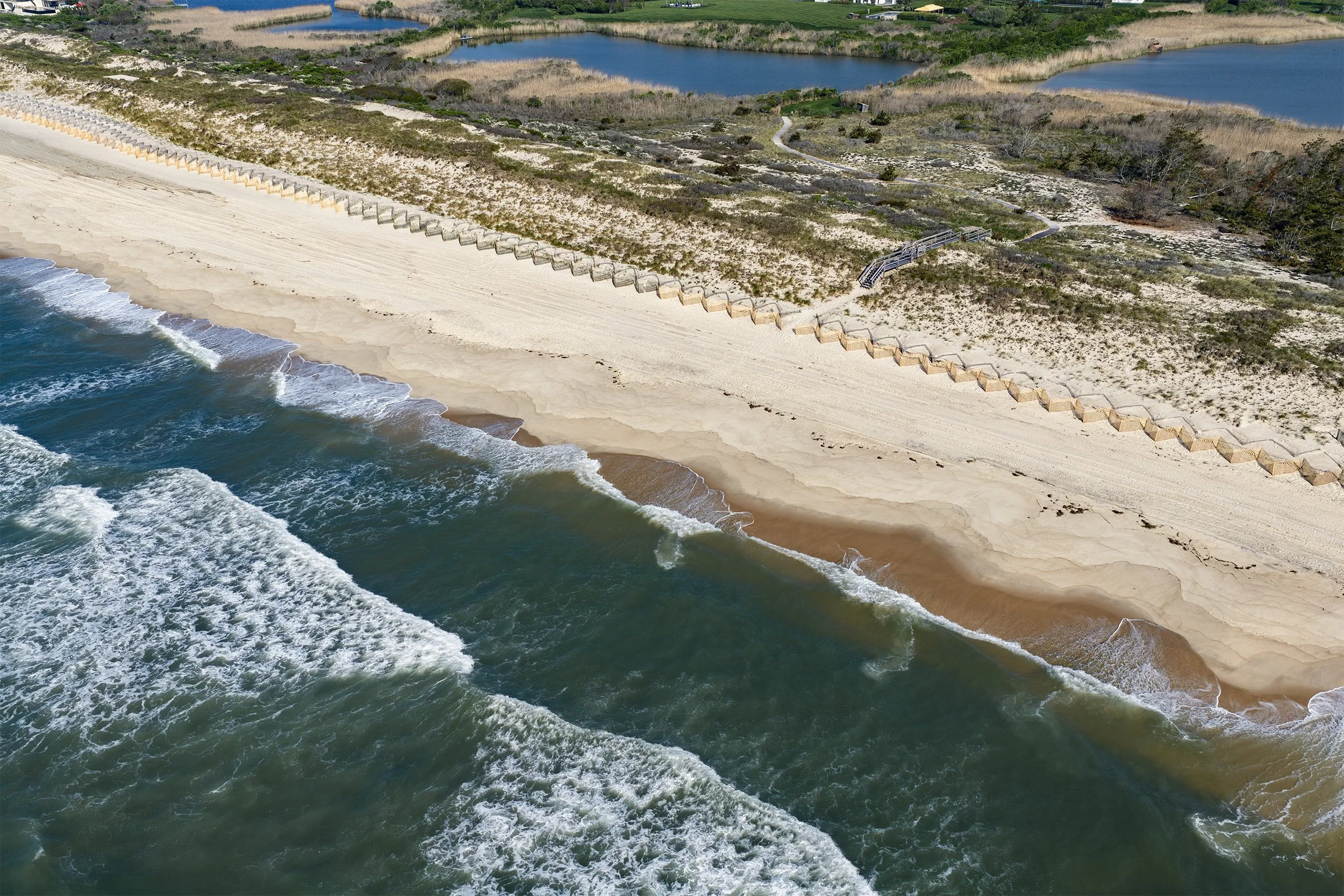
Hundreds of photos, one map
To generate a usable map, we don't take one photo — we fly a structured grid pattern over the site, capturing several hundred individual, overlapping images. Specialized software then stitches those images together into a single seamless, georeferenced map called an orthomosaic.
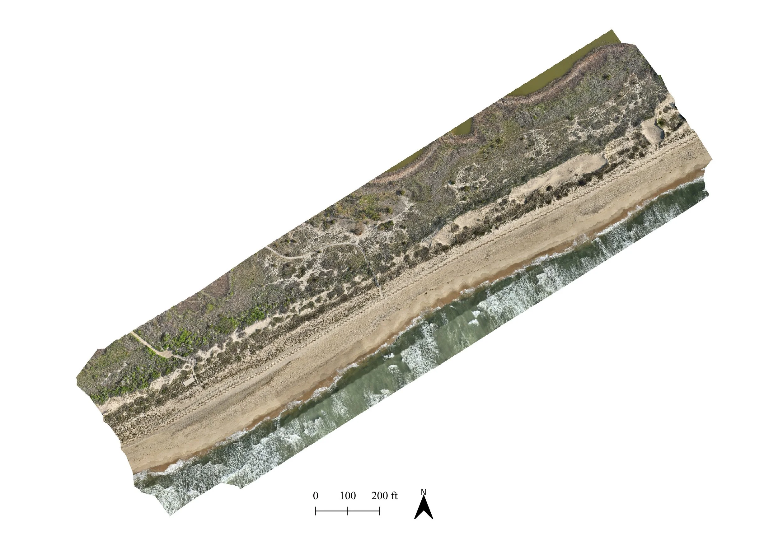
The result looks like a single photograph, but it isn't one. It's a mosaic, corrected for lens distortion and camera angle, and tied to real-world coordinates — which means it can be measured, overlaid with other data, and compared to a map of the same site flown a year, or five years, earlier.
Turning the map into data
The orthomosaic is the foundation. From there, we generate a digital elevation model (DEM) — a point-by-point measurement of ground height across the entire site, derived from the same set of photos using photogrammetry.
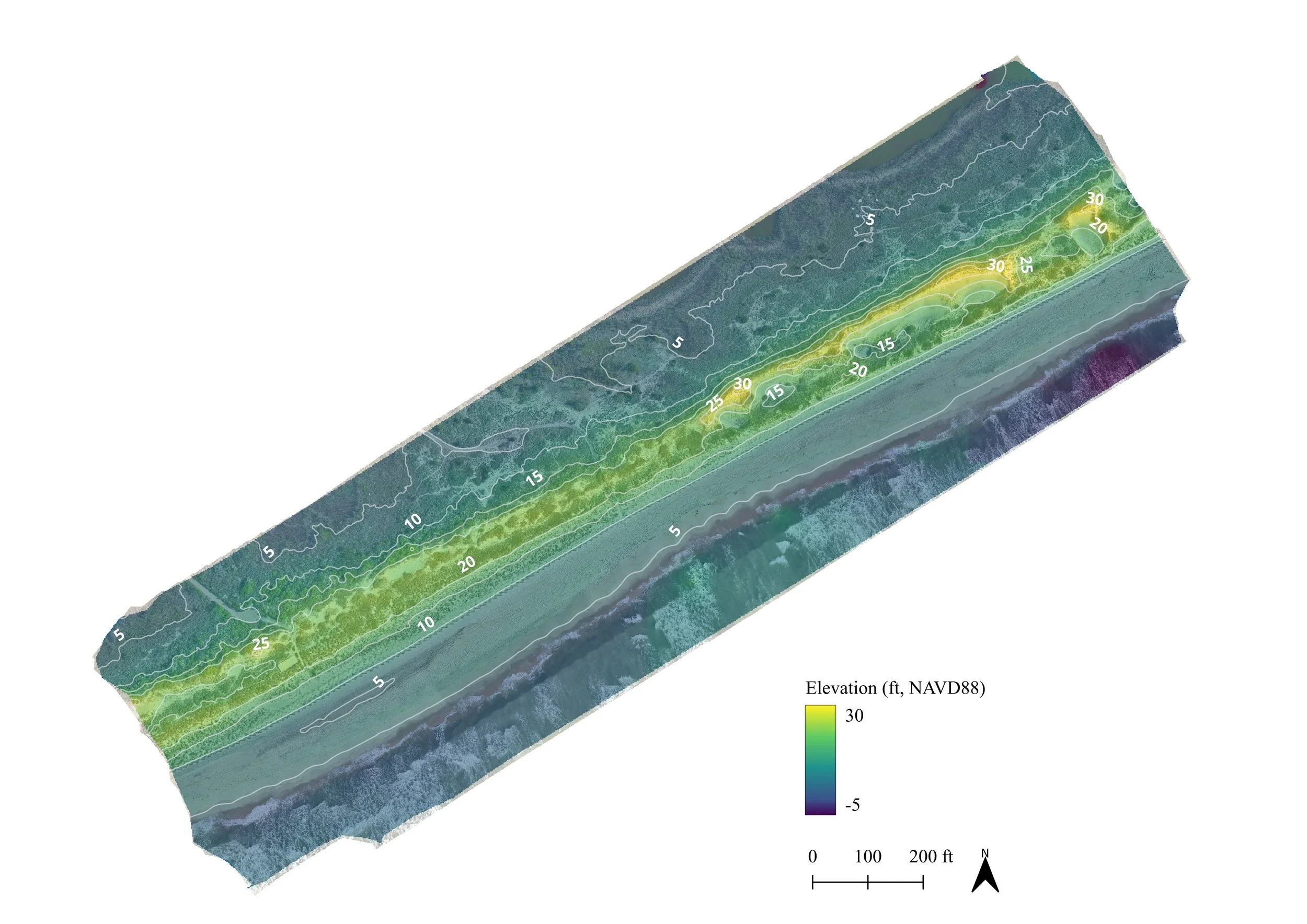
Here, color does the work that words can't. Blues and greens mark low elevation — the beach face and wetland edges. Yellow marks the highest points — the crest of the frontal dune, in places over 30 feet above sea level. Layered contour lines mark elevation in 5-foot increments, the same way a topographic map would.
This is the layer that actually answers the question a coastal monitoring project is usually asking: is the dune growing or shrinking, and where? Fly the same site again next year, difference the two elevation models, and you get a precise, quantified picture of sediment gain or loss — the kind of data that supports grant applications, storm-impact reports, and long-term shoreline management plans.
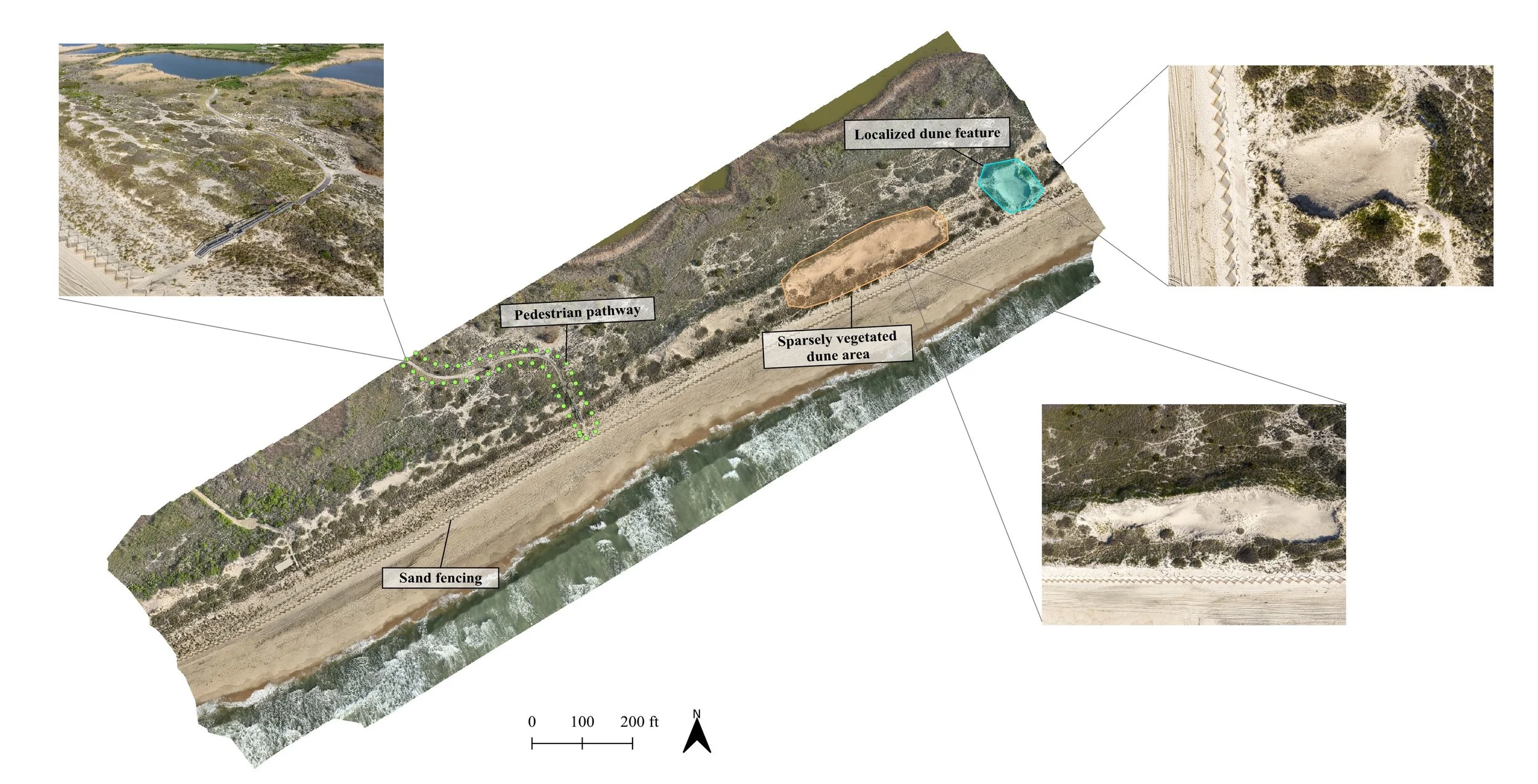
Reading the site
The last step is interpretation — annotating the map with the features that matter for the project at hand.
At Flying Point, that means marking the pedestrian pathway cutting through the dune, the sand fencing installed to trap wind-blown sand and rebuild the frontal dune, and a few localized dune features worth tracking individually. This annotated version is closer to what a client actually receives — not just a map, but a map that's been read and explained.
Why this matters
Coastal environments on Long Island are changing quickly — storms, sea level rise, and human use all reshape the shoreline year to year. A single photo can show you what a dune looks like today. A mapped, measured, and repeated survey can show you what's actually happening to it, which is the difference between a nice picture and usable data.
That's the service behind the photos: structured drone surveys, processed into orthomosaics and elevation models, and turned into something a conservation group, watershed organization, or municipality can actually use to make decisions.
If you're working on a coastal monitoring, habitat assessment, or shoreline change project on Long Island and want to talk through what a survey like this would look like for your site, get in touch — happy to walk through the process in more detail.